


Everyone would be feeling wondered when we see something moved with an animation. One of the best things about CSS is its ability to animate the components and make the visitors feeling wow. In today's article let's discuss one of the cool rules which specify the animation code in CSS.
It's none other than @keyframes.
Let's start with what is @keyframes?
As discussed above, the @keyframes rule specifies the animation code.
The animation is created by gradually changing from one set of CSS styles to another.
During the animation, we can change the set of CSS styles many times.
Specify when the style change will happen in per cent or with the keywords from and to, which is the same as 0% and 100%. 0% is the beginning of the animation, 100% is when the animation is complete.
How to declare and use it?
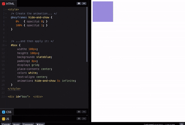
  @keyframes hide-and-show {
     0%   { opacity: 0; }
     100% { opacity: 1; }
  }
   #box {
      animation: hide-and-show 5s infinite;
   }
Every @keyframes statement needs a name. In this example, hide-and-show is the name of the animation.
As with the opacity property, animation requires a duration. Here we've said that the animation should last 5 seconds (5000ms) and it runs infinite time.
Try out this example in codepen
If an animation has the same starting and ending properties, one way to do that is to comma-separate the 0% and 100% values:
@keyframes fontbulger {
  0%, 100% {
    font-size: 20px;
  }
  50% {
    font-size: 16px;
  }
}
Calling keyframe animation with separate properties
.box {
 animation-name: bounce;
 animation-duration: 4s; /* or: Xms */
 animation-iteration-count: 10;
 animation-direction: alternate; /* or: normal */
 animation-timing-function: ease-out; /* or: ease, ease-in, ease-in-out, linear, cubic-bezier(x1, y1, x2, y2) */
 animation-fill-mode: forwards; /* or: backwards, both, none */
 animation-delay: 2s; /* or: Xms */
}
Animation Shorthand
Just space-separate all the individual values. The order doesn’t matter except when using both duration and delay, they need to be in that order. In the example below 1s = duration, 2s = delay, 3 = iterations.
animation: test 1s 2s 3 alternate backwards
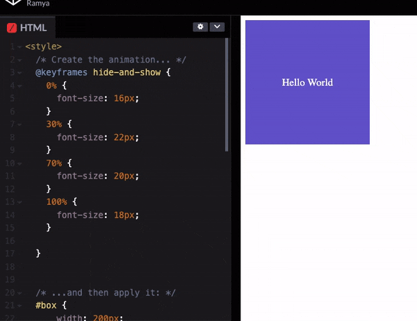
1. Multi-step animations
We can use percentages to allows us to add more than 2 steps.
 @keyframes hide-and-show {
    0% {
      font-size: 16px;
    }
    30% {
      font-size: 22px;
    }
    70% {
      font-size: 20px;
    }
    100% {
      font-size: 18px;
    }
 }
Try out this example in codepen.
2. Combine transform and animation
 @keyframes rotate {
    from {
      transform: rotate(0deg);
    }
    to {
      transform: rotate(360deg);
    }
  }
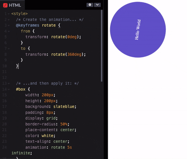
Tryout this in codepen
3. Alternating animations
Let's suppose that we want an element to "breathe", inflating and deflating.
We could set it up as a 3-step animation:
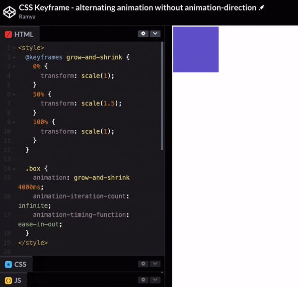
Try out this example in codepen
It spends the first half of the duration growing to be 1.5x its default size. Once it reaches that peak, it spends the second half shrinking back down to 1x.
This works, but there's a more elegant way to accomplish the same effect. We can use the animation-direction property:
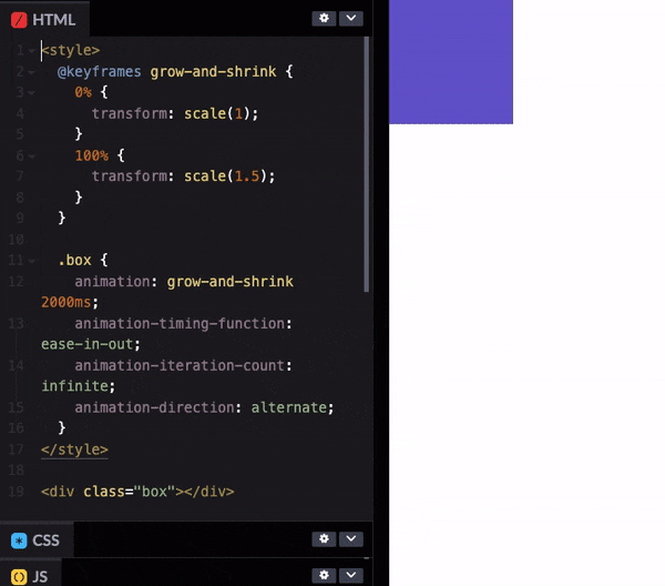
Try out this example in codepen
animation-direction controls the order of the sequence. The default value is normal, going from 0% to 100% over the course of the specified duration.
We can also set it to reverse. This will play the animation backwards, going from 100% to 0%.
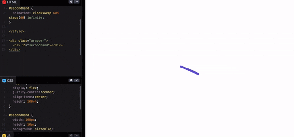
4. Steps()
The steps() function controls exactly how many keyframes will render in the animation timeframe.
Try out this example in codepen
References
- https://www.w3schools.com/cssref/css3_pr_animation-keyframes.asp
- https://css-tricks.com/snippets/css/keyframe-animation-syntax/
- https://www.joshwcomeau.com/animation/keyframe-animations/#just-the-beginning
Here comes an end with animation using CSS keyframes. Hope you enjoyed the article and learned something new. Thanks for taking the time to read this article. If you found this article useful follow me on Twitter and feel free to contact me anytime to discuss or share your ideas.